

I. A Date Written in Roman Numerals
The title cartouche at the top of this map carries a date in Roman numerals: MCXXXV. 1135. Not 1099, the year Jerusalem fell to the Crusading armies after a siege that ended in one of the medieval period's most complete massacres. Not 1096, when Peter the Hermit led his ragged vanguard out of the Rhineland toward a destination most of them could not have located on any map. 1135. A generation later. The moment when the world the First Crusade had violently produced was neither new nor secure — when the Crusader States had acquired the texture of permanent institutions while remaining, in military and demographic terms, profoundly fragile.
The choice of date is the map's first argument. To depict the Crusades at their moment of triumph — the fall of Jerusalem, the raising of the cross above the Dome of the Rock — would be to tell a story about conquest. To depict them a generation later is to tell a story about consequence: about what it meant to hold, govern, and inhabit a territory carved out of someone else's world, surrounded by powers that had not forgotten what had been taken from them and were already beginning to reclaim it.
Below the date, in the formal Gothic hand that runs through the map's Latin program, two words: Deus lo volt. God wills it. The battle cry attributed to the crowd at Clermont in November 1095, when Pope Urban II finished the sermon that launched the First Crusade and the assembled faithful, by one account, answered with a single voice. Whether anyone actually shouted those words at Clermont, or whether the phrase was retrospectively constructed into the movement's founding slogan, is a question historians have debated without resolution. What is certain is that by 1135 — the map's chosen moment — those words had already become myth, already carried the weight of an origin story that the Crusader States were using to legitimate their continued existence on ground that had been Muslim, Byzantine, Armenian, and Jewish for centuries before it was Latin.
That layering — the claim, the counter-claim, the palimpsest of sovereign assertions written and overwritten on the same contested geography — is what this map is about. And the primary instrument through which it makes its argument is not the borders, not the colors, not even the careful political geography. It is the scripts.
II. The Object
The map is oriented vertically, the coastline of the eastern Mediterranean running down its left side like a spine. The sea itself — Mare Mediterraneum, labeled in the same Gothic hand as the title — occupies the left third of the cartographic space, its deep blue-green wash providing the visual anchor against which the polities of the Levantine interior are arranged. This is accurate to the strategic reality of 1135: the Crusader States were, above all, coastal entities, their survival dependent on control of the ports through which men, horses, timber, and provisions arrived from the Latin West. Inland, they were always contested. At the sea, they had a chance.
The four Crusader polities are immediately legible against the cooler grounds of their neighbors. The Kingdom of Jerusalem — Regnum Hierosolymitanum — runs the length of the southern Levantine coast, its narrow strip of territory between the Mediterranean and the desert capturing with cartographic precision the existential problem of the Latin presence in the Levant: a state one determined thrust from the east could sever from the sea entirely. To its north, the Comitatus Tripolitanus occupies a similarly coastal configuration. Above it, the Principatus Antiochenus spreads inland toward the Orontes valley, its greater territorial depth reflecting both its earlier consolidation and its proximity to Byzantine support. Furthest north and most exposed, the Comitatus Edessanus floats in orange isolation above the others — separated from its sister states by terrain, surrounded on three sides by powers that regarded its existence as a provocation. It was the first of the four to fall, taken by Zengi in 1144, nine years after this map's chosen date. Looking at it here, the vulnerability is visible in the geography before a word of history is read.
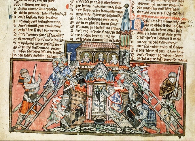
14th Century Manuscript Depiction of the Capture of Antioch (source)
The Color Argument
The map's color program encodes its political argument before a single label is read. The four Crusader and Christian polities — Jerusalem, Tripoli, Antioch, Edessa, and the Byzantine and Armenian zones — are rendered in saturated hues: yellow-gold, orange, pink, maroon, navy. They are vivid, individuated, each distinguished from the others by a distinct color identity. The Islamic powers surrounding them — the Seljuk Sultanate of Rûm, the Danishmendids, the Zengids, the Burid dynasty of Damascus, the Fatimid Caliphate — are rendered in variations of green: sage, olive, grey-green, the cooler tones of a different political world. This is not merely a convenient way to distinguish friend from enemy. Green has been the color of Islam since the early caliphates — the Prophet's banner, the Abbasid standard, the color that appears in mosque tile work and Quranic illumination across a thousand years of visual culture. The map renders the Islamic world in its own color as it renders the Latin world in Latin script: from the inside, in the tradition's own terms. The warm-cool contrast between the two zones is also a geographic argument: the Crusader States burn brightly in their narrow coastal corridor, vivid and exposed; the Islamic world surrounds them in cooler, larger, older tones. The color differential is the political differential made visible.
The Assassins
Between the Comitatus Tripolitanus and the Principatus Antiochenus, in the coastal mountain zone of the Jabal Ansariyya, a label appears in red Arabic script: فرقه حشاشیون — Firqat al-Ḥashshāshīn. The Assassins. The Nizari Ismaili order, whose mountain fortresses — Masyaf most prominently — occupied precisely this corridor between the two Crusader states, is the only power on the map given its own distinct label color. Not the green of the surrounding Seljuk and Zengid labels. Not the Gothic black of the Latin Crusader names. Red: the color of a power that belonged to neither camp, that was simultaneously at war with the Sunni Zengids, in complex negotiation with the Crusader States, and pursuing its own political theology that neither Latin Christendom nor Sunni Islam could fully accommodate.
The Nizari Ismailis under Rashid al-Din Sinan — the Sheikh of the Mountain of Crusader legend — occupied a position of remarkable political independence in the twelfth-century Levant. Too small to conquer, too dangerous to ignore, they sold their military services and their calculated violence to shifting coalitions while maintaining a doctrinal independence that made them theological outlaws in every surrounding tradition. The Crusaders needed them as a buffer against Zengid expansion; the Zengids feared them; the Sunni caliphate had already declared them heretics. Their red label on this map is the cartographic equivalent of that position: present, distinct, belonging to no color-coded bloc, impossible to assimilate into the binary the standard Crusades narrative imposes.

The Ruins of the Assassins' Fortress at Masayf (source)
What distinguishes this map from a standard Crusades map is the experience of moving across its surface and watching the script change beneath you. Regnum Hierosolymitanum in Gothic Latin. الخلافة الفاطمية in Arabic. Βασιλεία τῶν Ῥωμαίων in Greek minuscule. Կilիկեan Հայkutiwn in Armenian erkatagir. Four orthographic worlds occupying the same cartographic space, each writing its claim on the same landscape in a different hand, a different tradition, a different history of how letters are made and what they are for. The conventional map of the Crusades gives you one script, one perspective — usually Latin, occasionally modernized English — and in doing so quietly asserts that the Latin perspective is the organizing one. This map refuses that assertion. It asks the viewer to move between worlds rather than settle in one, and in doing so makes its historical argument through the act of reading itself.
The border program frames this multilingual interior with the visual vocabulary of Latin medieval manuscript culture. At the top left, an illuminated initial — a deep cobalt E with gold hatching, drawn from the tradition of Romanesque illuminated letters — opens the title Expeditio Crucis. Flanking it are two miniatures from period sources: on the left, a robed figure in the flat jewel-toned palette of Byzantine manuscript painting; on the right, a mounted crusader knight in white surcoat and red cross, copied from the Codex Manesse tradition. The heraldic shields along the margins identify the major military orders: the white cross on red of the Knights Hospitaller, the red cross on white of the Templar, the gold Jerusalem cross on white of the Kingdom itself — five crosses whispering a quincunx, one for each wound of Christ, the most theologically saturated heraldic image in the medieval West. At the map's lower center, the Jerusalem cross appears again, largest of all, as a visual full stop beneath the cartographic argument above it.
At the lower right, framed in a blue and gold cartouche with its own illuminated initial, the troubadour poem. I will return to it.
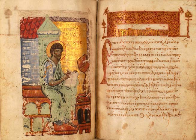
Folio from a 12th Century Byzantine Manuscript (Gospel of St. Luke) (source)
III. What the Scripts Know
Each of the four orthographic traditions on this map underwent significant transformation across the medieval period, and the forms appropriate to 1135 are not always the forms most familiar to modern eyes. Reproducing them required consulting primary manuscript sources rather than modern standardized orthography — and in each case that research revealed how much the conventional representations of medieval scripts in popular history have smoothed over distinctions that contemporaries would have found immediately meaningful.
The Gothic hand used throughout the map's Latin program belongs to the transitional period of the early twelfth century, when the letterforms that would fully develop into Gothic were already distinguishable in manuscript culture but had not yet calcified into the rigid regularization of the high Gothic period. The long s, the slightly compressed verticals, the careful but not yet mechanical stroke — these are details drawn from twelfth-century Latin manuscripts rather than any modern reproduction of "medieval script." The place names follow medieval rather than classical orthography: Hierosolymitanum rather than Hierosolyma, Antiochenus rather than Antiochia. These are the forms that appear in Fulcher of Chartres and William of Tyre, the Latin as it was actually written by the people who built and governed these polities.
The Arabic script program presented a different order of difficulty. The Seljuk successor states and Zengid dynasty labeled on this map operated within a Persian-inflected Arabic administrative culture — they wrote political identity in Arabic script but with Persian grammatical and lexical conventions that shaped how names and titles were formed. The formula دودمان — dudman, dynasty, a Persian word written in Arabic script — appears before each ruling house's name as historical precision: this is how these powers named themselves in their own documents, and the map preserves that self-naming rather than substituting a geographic label that would erase the dynastic character of their sovereignty.
Of the four scripts, Greek presented the most subtle challenge, precisely because Greek has never ceased to be written and the continuity conceals significant change. The Greek minuscule of the twelfth century — the script in which Byzantine scribes produced the theological and administrative documents of the Komnenian period — is recognizably Greek to any modern reader, but its specific letterforms, its ligatures, its treatment of breathings and accents, belong to a manuscript tradition that diverged meaningfully from both ancient inscriptional Greek and modern printed Greek. The label Βασιλεία τῶν Ῥωμαίων follows twelfth-century minuscule conventions drawn from manuscript sources at Dumbarton Oaks and the Bodleian. It is worth pausing on that name. The Byzantines were not Byzantines — they were Romans, Rhomaioi, and their emperor was the legitimate successor of Constantine in an unbroken legal and theological chain. When the Crusaders arrived at Constantinople in 1096, they were entering what its inhabitants understood as Rome, and they were regarded with the profound ambivalence that Rome reserves for useful barbarians.
The erkatagir — literally "iron letters," the formal Armenian block script — is the most immediately distinctive orthography on the map, its angular forms identifiable at a glance as belonging to no other tradition. Armenian Christianity preceded Latin Christianity in the Levant by centuries; the Armenian kingdom of Cilicia in the map's north was a polity the Crusades encountered already in place, with its own ecclesiastical hierarchy, its own dynastic history, and its own sophisticated diplomatic intelligence. By 1135, the Rubenid dynasty had spent decades managing a three-way relationship between the Crusader States, the Byzantine Empire, and the Seljuk powers with a pragmatism that belied their small territory. They were active political agents whose alliance both Constantinople and Jerusalem competed for, capable of playing their larger neighbors against each other with considerable skill. The stability of the erkatagir itself — recognizably similar in form to the alphabet Mesrop Mashtots created in the early fifth century — encodes something about that durability: a script unchanged across seven centuries of invasion, conversion pressure, and imperial absorption is a form of resistance, a refusal to dissolve into the larger visual cultures surrounding it.
To move across this map reading these four scripts in sequence is to perform, in miniature, the experience of the twelfth-century Levant itself: a world in which four orthographic traditions, four civilizations, occupied the same geography simultaneously, each legible in its own terms, none reducible to the others. The Crusaders named their kingdom Regnum Hierosolymitanum. The people around them continued to call the city القدس — the Holy — as they had before the Crusaders arrived and would long after they left.

A precursor map of the Crusades I made years before this final version
IV. The Empire That Refuses the Binary
The standard reading of a Crusader map sees a binary: Christian versus Muslim, West versus East. The geography here makes that reading untenable.
Consider the northern third of the cartographic space. The Sultanate of Rûm occupies most of Anatolia in a pale wash, its boundaries contested against both Byzantine recovery and Danishmendid competition. The Danishmendids control a substantial territory in central Anatolia — a third Turkic power, neither Seljuk nor Byzantine nor Crusader, requiring independent understanding. The Zengids under Imad ad-Din Zengi appear in the northeast: the consolidating force in northern Syria and the Jazira whose patient accumulation of power the Crusader States consistently underestimated. The map gives him his dynastic label — دودمان زنگیان — as his own chancery would have written it, without the retrospective significance that knowing 1144 lends to the name.
The Byzantine Empire is structurally central. Cyprus is Byzantine. Coastal Cilicia is contested between Byzantine reassertion and Armenian consolidation. Antioch — the Principatus Antiochenus — had been Byzantine within living memory, taken by the Seljuks in 1084 and then by the Crusaders in 1098, and Constantinople had never formally abandoned its claim. The relationship between the Crusader States and the empire they had passed through on their way to Jerusalem was one of the defining diplomatic tensions of the twelfth century: the Latins needed Byzantine naval power and could not have maintained their coastal position without it; the Byzantines regarded the Franks as useful and dangerous simultaneously, capable of defending eastern approaches while occupying territory the empire considered its own. The map encodes this ambiguity by giving the Byzantine presence its own visual weight — its own color, its own script, its own name — rather than treating it as background to a Latin foreground.
And beneath all of this, the Fatimid Caliphate — الخلافة الفاطمية — holds Egypt and the Sinai in a dark grounded wash that extends south off the map's edge. The Fatimids had lost Jerusalem in 1099 but remained the dominant power in the region by any economic and demographic measure. That the Kingdom of Jerusalem survived its early decades owed something to the persistent rivalry between Fatimid Cairo and Seljuk Syria — a rivalry the Franks were adept at exploiting without ever fully controlling. The map shows the Fatimid presence as it was: vast, ancient, entirely indifferent to the Latin kingdom's self-understanding as a providential achievement.
The Crusader States are the center of their world, but not of the world of their neighbors. Jerusalem sits in the lower middle distance, labeled in Latin among a sea of Arabic place names — بصرى، دمشق، حلب — that remind the viewer that the Arabic-speaking world did not reorganize itself around the Latin presence in its midst. The yellow-gold of the Kingdom is vivid but narrow. Everything around it is older, larger, and waiting.

11th Century Depiction of Fatimid Soldiers (source)
V. The Nightingale and the Map
Quan lo rossinhol el follos — When the nightingale in the foliage — opens the troubadour poem in the lower right cartouche, its illuminated Q rendered in blue and gold in the manner of a Romanesque manuscript initial. The poem is a crusading alba: a dawn song in which the conventional parting of lovers at daybreak becomes a metaphor for the crusader's departure from home, beloved, and ordinary life toward the holy war in the distant east. The genre fuses the erotic and the devotional so completely that it becomes impossible to separate them — and that fusion was not incidental but theologically precise. The crusading movement understood the knight's love for God in the same terms it understood courtly love: as a desire that exceeded the self, demanded sacrifice, and ennobled the one who felt it. This is the same spiritual grammar that structures Wolfram von Eschenbach's Parzival — the Grail knight's quest as a form of sacred longing indistinguishable in its psychology from erotic desire, the wound and the healing inseparable — and it is the grammar of the troubadour tradition from which the alba descends.
The poem is transcribed here in full from the map's cartouche, where two lines are rubricated — written in red ink, in the medieval manuscript convention that marks passages of special liturgical or theological weight. That editorial choice is itself an interpretive act: the red lines are the poem's theological pivots, the moments where the alba's erotic grammar tips fully into devotional claim.

Quan lo rossinhol el follos
Amors alegre·m part de vos Per tal car vau mo mielhs queren E foi de tan, aventuros Qu'en breu n'auray mon cor jauzen La merce de mon bel Guiren Que·m vol e m'apell'·e·m denha, E m'a tornat en bon esper.
E qui sai rema deleytos E Dieu non fiec en Belleen, No sai cum ja mais sia pros Ni cum ja venha guerimen, Qu'ieu sai e cre mon escïen Que selh qui Ihesus ensenha Segura escola pot tener.
When the nightingale in the foliage —
Love joyfully parts me from you, For I go seeking my better self, And am so fortunate an adventurer That I will soon have my heart rejoicing, By the mercy of my fair Lord Who desires me, calls me, and condescends to me, And has restored me to good hope.
And he who remains here in pleasure And does not trust in God at Bethlehem — I do not know how he can ever be worthy, Nor how he will find his remedy, For I know and believe with full understanding That he who follows the teaching of Jesus Can hold to a safe and certain path.
The first rubricated line — Que·m vol e m'apell'·e·m denha — names the divine condescension: God not merely calls but deigns to call, the theological weight falling on that single word. Condescension in the medieval sense is not patronizing but miraculous — the infinite stooping to the finite, the Creator choosing to desire the creature. That the alba's beloved should be characterized this way converts the entire erotic grammar of the genre into a statement about grace. The second rubricated line — Que selh qui Ihesus ensenha — delivers the promise that the first stanza's divine desire makes possible: those who follow Christ's teaching hold a segura escola, a safe and certain path. The rubrication marks exactly what the poem most wants the reader to carry away: the call, and the safety of answering it.
The second stanza's turn is worth pausing on. E qui sai rema deleytos — and he who remains here in pleasure — is a direct address to the man who does not go, who stays home in comfort while the crusader departs. The word guerimen — remedy, healing — carries a medical register that connects to the Grail wound motif in Parzival: the knight's quest is simultaneously a search for external Jerusalem and an internal healing, the wound that only the right question can close. He who does not go, the poem suggests, remains unhealed.
The poem speaks from the moment of departure — the nightingale still singing, the beloved still present, the horizon still promising. The map speaks from the moment of arrival, a generation on. What the nightingale's lover went seeking is visible in the narrow yellow strip of the Kingdom of Jerusalem, in the isolated orange of Edessa floating above its enemies, in the thin coastal line of cities — Tyrus, Sidon, Caesarea, Jaffa — on which the entire Latin project depended. The poem's joy and the map's geography are in permanent tension. Neither cancels the other.
One line stays with me: vau mo mielhs queren — I go seeking my better self. It is among the most honest statements in the crusading literature. Not I go to free Jerusalem, not I go to fulfill a vow — though the poem contains those things as well — but something more intimate and more troubling: I go because I am looking for something in myself that I cannot find here. The Crusades began, in part, in that sentence. The map, with its four scripts and its fragile Latin polities pressed against the sea, is a record of what was found.
Sources and Artistic References
Historical Sources
Asbridge, Thomas. The Crusades: The Authoritative History of the War for the Holy Land. New York: Ecco, 2010.
France, John. Victory in the East: A Military History of the First Crusade. Cambridge: Cambridge University Press, 1994.
Murphy, G. Ronald. Gemstone of Paradise: The Holy Grail in Wolfram's Parzival. Oxford: Oxford University Press, 2006.
Prawer, Joshua. The Latin Kingdom of Jerusalem: European Colonialism in the Middle Ages. London: Weidenfeld and Nicolson, 1972.
Riley-Smith, Jonathan. The First Crusaders, 1095–1131. Cambridge: Cambridge University Press, 1997.
Von Eschenbach, Wolfram. Parzival. Trans. A.T. Hatto. London: Penguin, 1980.
Troubadour Sources
Chaguinian, Christophe. "The Troubadours and the Song of the Crusades." Tenso (2008).
Artistic and Manuscript Sources
Illuminated initial: Christianus Prolianus, Astronomia manuscript, c. 1470–1480.
Mounted knight miniature: Codex Manesse, Heidelberg, early 14th century.
Greek minuscule script: Minuscule 537, 12th century; Dumbarton Oaks Byzantine Collection; Bodleian Library Byzantine manuscripts.
Armenian erkatagir script: Bodleian Library Armenian manuscript collection.
Medieval Arabic script: British Library Endangered Archives Programme (EAP399); In Libris medieval Arabic sources.
Illuminated initials: Europeana illuminated initials gallery.
Border ornament: Zwettl Abbey stained glass tradition; Map Psalter, 13th-century English manuscript.